
Costbars Project Portfolio Scheduler
Easily manage your pipeline of project investments.
The features that make Costbars different
Enterprise PPM tools cost a fortune and take months to implement. Costbars delivers the four capabilities portfolio managers actually use — strategic scoring, bubble charts, pipeline scheduling, and demand levelling — without the price tag or the implementation project.
Multi-Criteria Strategic Scoring
Score every project against your own weighted strategic criteria and let the numbers do the ranking. Objective scoring removes the politics from portfolio selection — every project is measured consistently, every time.
Bubble Chart Visualisation
Plot your entire portfolio on a value-vs-risk bubble chart in one click. Bubble size represents investment. See which projects deserve the green light, which need scrutiny, and which should be deferred — all at a glance.
Drag-and-Drop Pipeline Scheduling
Lay approved projects across the fiscal calendar and drag them to fit available capacity. No rebuilding a spreadsheet every time priorities shift — just move the projects and the resource demand numbers update immediately.
Resource Demand Levelling
Aggregate demand from every active and proposed project into a single time-phased grid. See where capacity peaks occur, then resequence the pipeline to smooth demand before it becomes a delivery bottleneck.
All 10 features detailed below — or see pricing to get started today.
Costbars Feature List
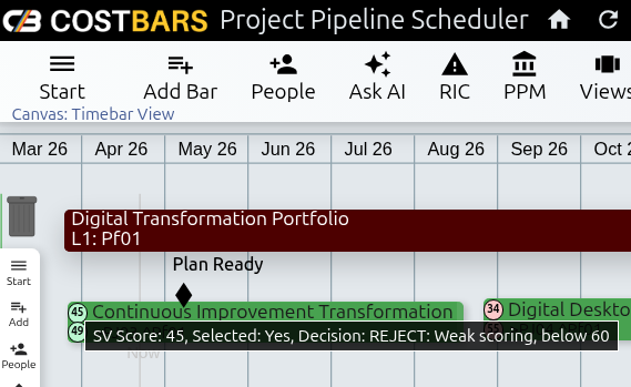
Portfolio Pipeline Canvas
The Costbars canvas gives you an immediate view of your entire project portfolio on a single timeline. Brown portfolio bars group related initiatives; green project bars sit beneath them; the small circles indicate Strategic Value and Ability to Execute. Drag projects along the timeline to adjust their scheduled start, and watch cost and resource demand figures update in real time.
Zoom in and out to move between a week-level view of active projects and a year-level view of the full pipeline. The Filter Menu lets you narrow the canvas to a specific portfolio grouping, strategic pillar, or project status — useful when the full view is dense and you need to focus on a particular subset for a review meeting.
Your entire investment pipeline in one scrollable view.
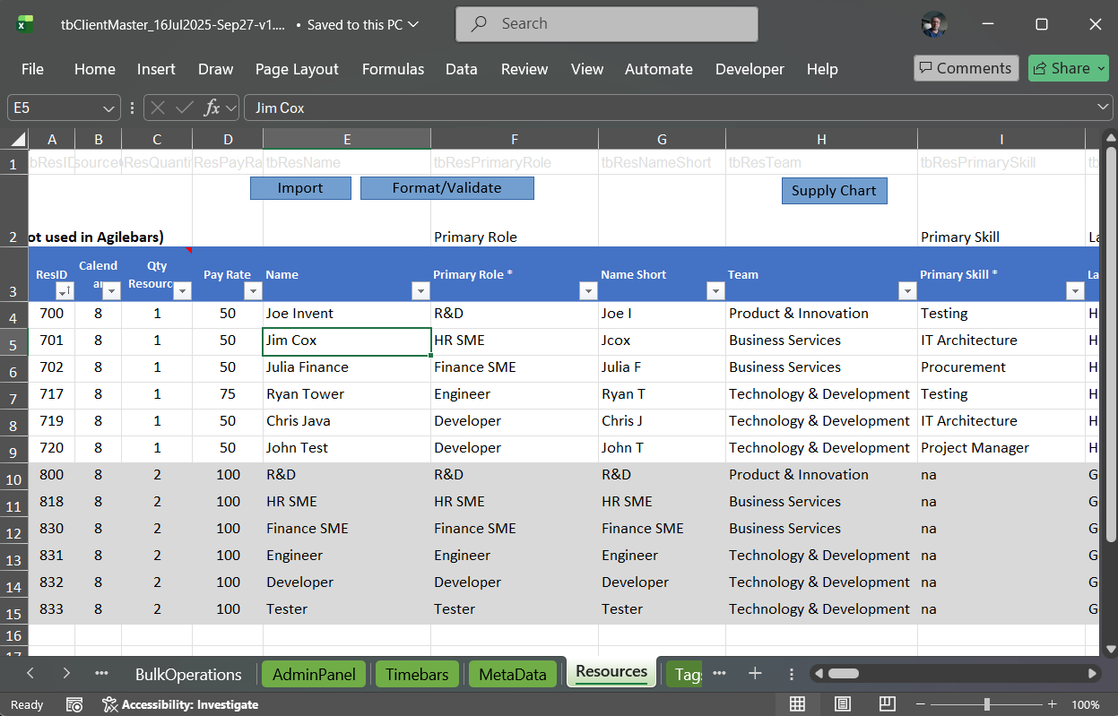
Spreadsheet-Based Data Management
The Costbars spreadsheet template is the primary data entry and management tool for the portfolio. It contains pre-structured tabs for portfolios, projects, work packages, resources, risks, issues, and custom metadata. Populate or update data in bulk using the tools you already know — copy-paste, Excel formulas, pivot tables — then drag the file onto the Costbars canvas to sync the changes. No re-keying through web forms, no import wizards.
The Portfolio tab in the template can be configured to pull only the specific fields you need for a particular report or analysis, making it straightforward to produce tailored outputs for different audiences from the same underlying data. For organisations that manage project data across multiple systems, the spreadsheet is also the integration point — data can flow in from other tools through the template before being imported into Costbars.
Manage portfolio data the way your organisation already works.
Strategic Scoring & Multi-Criteria Prioritisation
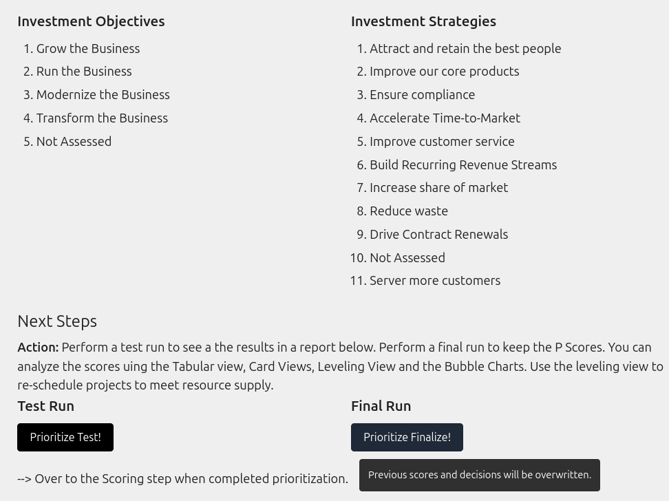
Define your own scoring criteria — strategic alignment, financial return, operational risk, regulatory compliance, or any combination — and assign a weight to each. Costbars scores every project against these criteria consistently, producing a ranked list that reflects your organisation's priorities rather than the loudest voice in the room. Scoring models are configured in the spreadsheet and can be updated as strategic priorities evolve.
Run scoring at any point in the portfolio cycle: during initial intake to filter out weak proposals, before annual planning to rank the full pipeline, or mid-year to re-evaluate in-flight projects against new strategic direction. Because the same criteria apply to every project every time, the results are defensible in governance forums and board presentations.
Data-driven prioritisation that removes the politics.
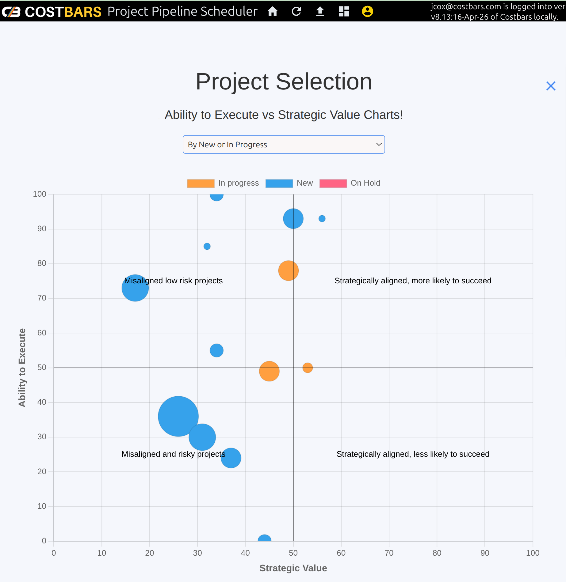
Bubble Chart Portfolio Visualisation
The bubble chart is the most powerful view in Costbars for communicating portfolio composition to senior stakeholders. Each bubble represents one project. Position on the horizontal axis reflects strategic value, position on the vertical axis reflects risk or complexity, and bubble size reflects the investment required. The chart makes it immediately obvious which projects are high-value and low-risk (worth accelerating), which are expensive and risky (worth challenging), and which cluster in the middle.
Configure the axes using any scored dimension in your model. Run the chart on the current portfolio, on proposed projects only, or on both overlaid to compare in-flight and planned work. Export directly for board presentations. This single chart often drives more useful portfolio discussion than any amount of tabular data.
See your entire portfolio strategy in one chart.
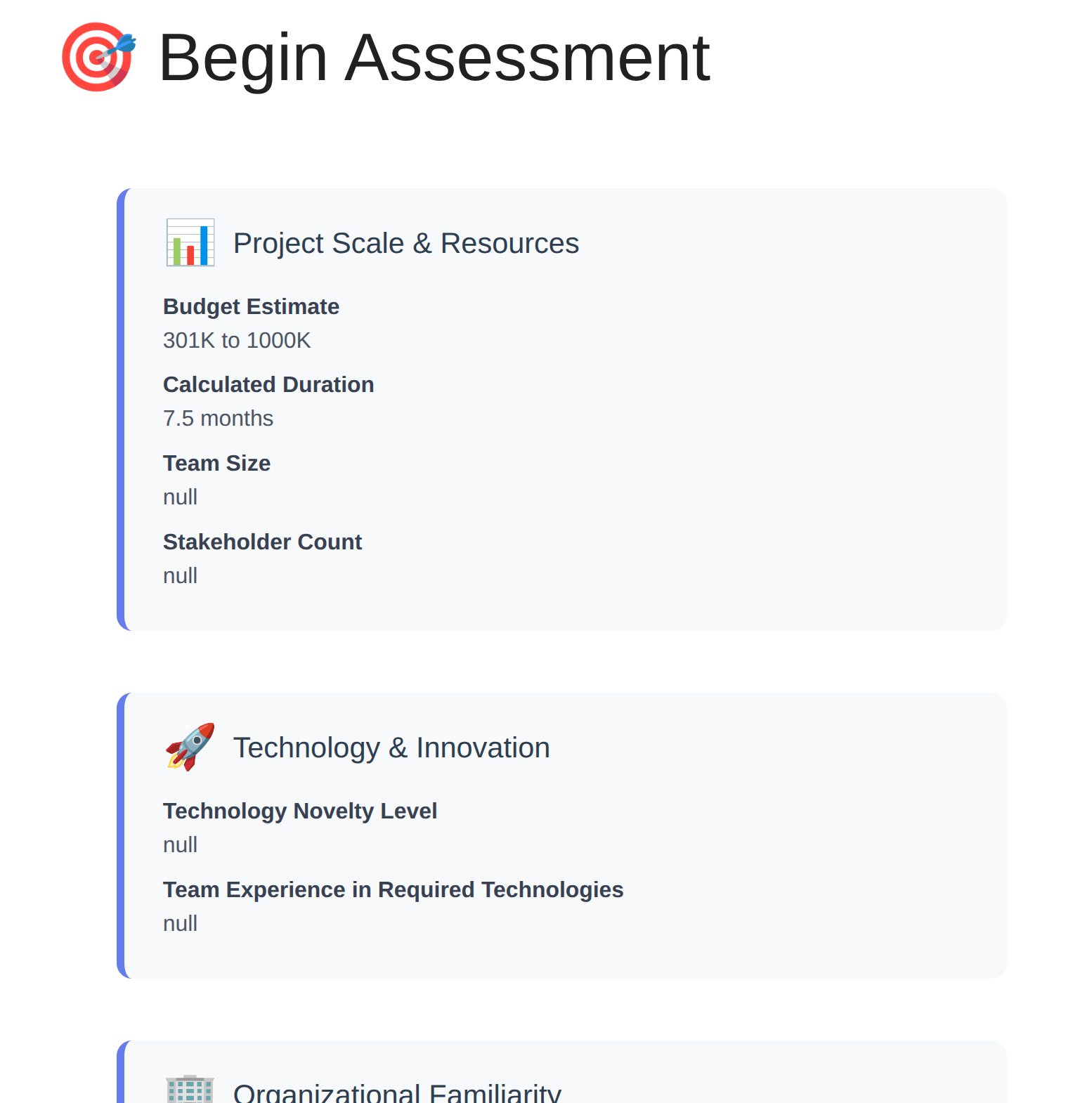
Objective Project Feasibility Assessment
Before committing resources to a project, run it through the Costbars feasibility assessment. Score the project across four dimensions — technical risk, political risk, size, and complexity — to generate an objective feasibility score from 0 to 100. Colour-coded risk levels and tailored recommendations surface the factors most likely to cause delivery problems before a single resource is assigned.
The assessment creates a consistent, documented basis for go/no-go decisions that is independent of who is championing the project. When two competing projects have similar strategic scores, the feasibility assessment provides the tiebreaker. And because the scores are on record, you can review them retrospectively after project delivery to calibrate the model for future assessments.
Know the real risks before you say yes.
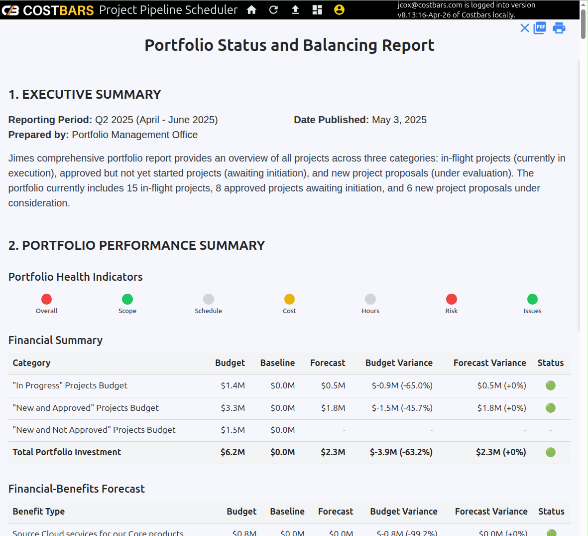
Portfolio Detail & Investment Balancing Report
The portfolio balancing report shows exactly where your investment is allocated across in-flight, approved, and proposed projects — broken down by budget, hours, and risk exposure. At-a-glance health indicators for scope, schedule, cost, hours, risk, and issues give the portfolio manager an immediate sense of overall portfolio health without having to drill into individual project reports.
Strategic alignment analysis shows how your budget is distributed across pillars such as Maintenance, Innovation, Growth, and Compliance. If 80% of investment is going into maintenance projects at the expense of growth initiatives, this report makes that visible and quantifiable. Specific rebalancing recommendations are generated based on your organisation's configured risk tolerance and strategic weighting.
See exactly where every pound and hour is going.
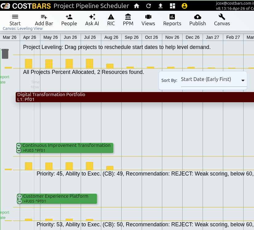
Project Demand Levelling
Costbars aggregates resource demand from every project in the pipeline — active, approved, and proposed — into a single time-phased demand grid. Each row shows demand for a specific resource, role, or skill group. Each column is a time period. The grid makes it immediately visible where demand exceeds supply, and by how much.
To resolve overallocation, drag projects along the pipeline timeline to shift their start dates and smooth the demand curve. Link projects with predecessor dependencies so that sequencing constraints are respected as you reschedule. The demand grid updates in real time as you move projects, so you can see the effect of each change before committing to it. This is the workflow that turns a list of approved projects into a deliverable programme.
Turn approved projects into a programme your team can actually deliver.
Executive Alert & Risk Monitoring Hub
Configure thresholds for the metrics that matter — budget overrun percentage, schedule delay in weeks, strategic score below a minimum, risk level above a maximum, or executive commitment flags — and Costbars monitors the portfolio continuously. When a project crosses a threshold, the system sends context-rich alerts via SMS, push notification, and email so that the right people are informed immediately.
The alert system is designed to eliminate noise. Only executives configured as owners of a given project receive its alerts. Thresholds are set per metric per project, so a project with inherently higher risk tolerance does not trigger the same alerts as a critical regulatory programme. The result is a monitoring system that informs rather than overwhelms.
Know about problems before they reach the board.
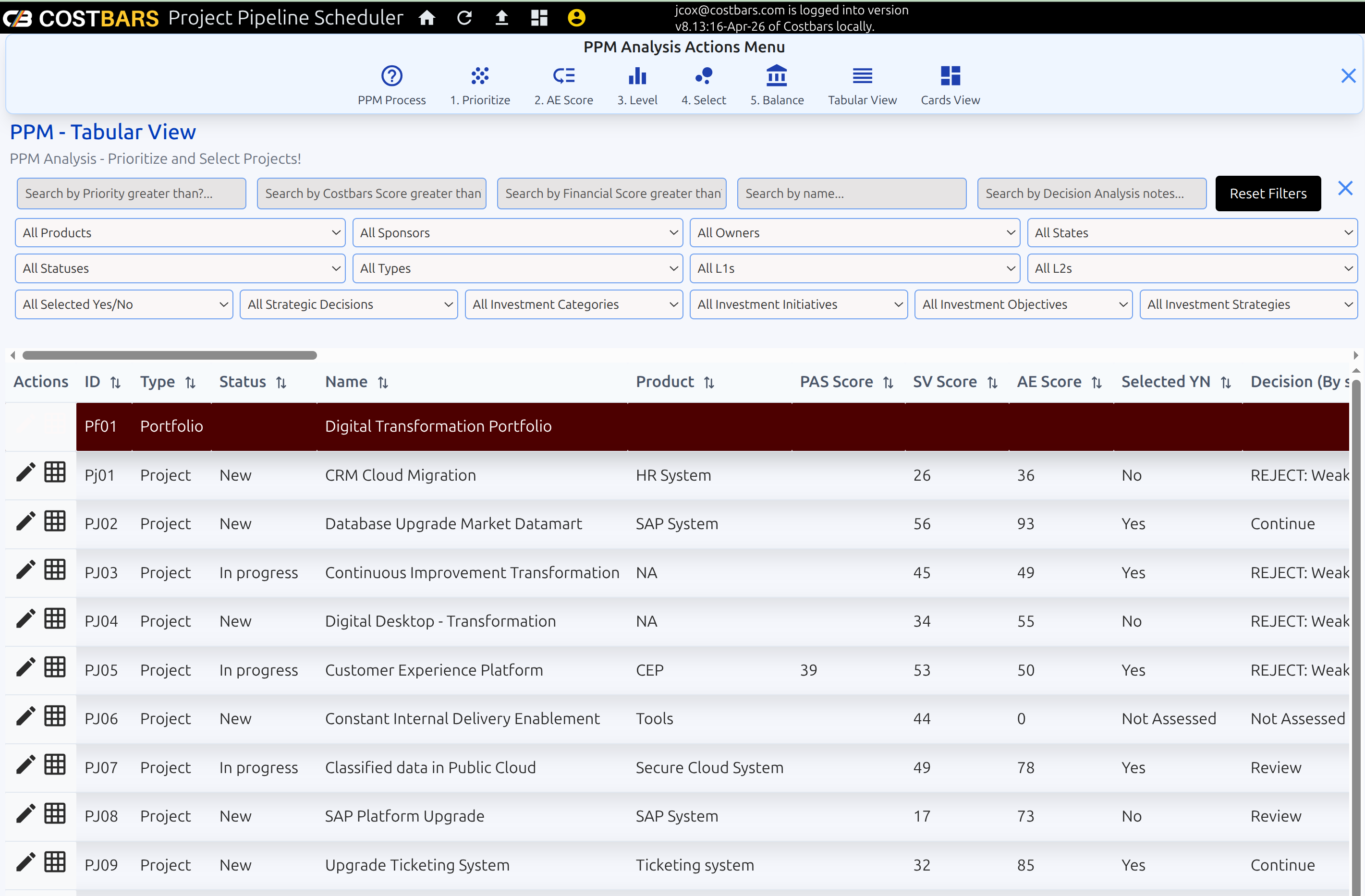
Pipeline Tabular View & Analysis
The tabular view provides one row per project across the entire portfolio, with configurable columns showing cost, hours, schedule, priority score, risk level, strategic alignment, and any custom metadata field you have defined. Sort by any column, apply filters to focus on a specific portfolio segment, and export for offline review or governance reporting.
The tabular view is the right tool for working meetings where you need to step through the portfolio systematically rather than navigate a visual canvas. Filter to show only projects above budget, sort by strategic score to identify the highest-priority items, or group by strategic pillar to review balance across the portfolio. It is also the starting point for the formal scoring and selection workflow.
The right view for systematic portfolio analysis.
Card View for Executive Briefings
Switch to card view for a visual format designed for executive briefings and portfolio review meetings. Each project appears as a card showing its name, strategic score, risk level, budget status, schedule health, and key metadata at a glance. Colour-coded indicators make it straightforward to scan the portfolio quickly and identify items that require attention.
Cards can be sorted and filtered the same way as the tabular view, so you can prepare a filtered deck for a specific audience — showing only the projects relevant to a particular steering committee, for example — without creating a separate report. The card view is also useful for stakeholders who are not portfolio specialists and find the canvas view or tabular data too detailed.
Board-ready portfolio visibility in seconds.
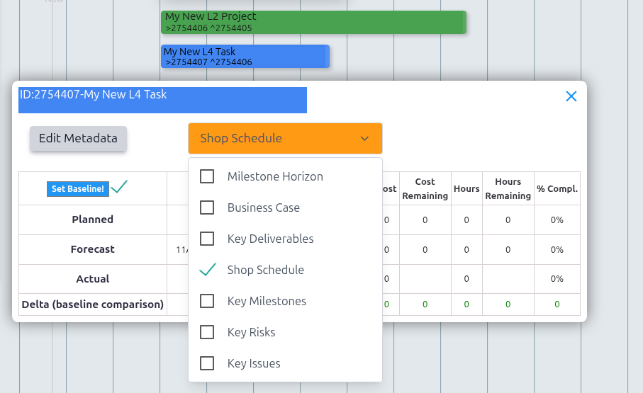
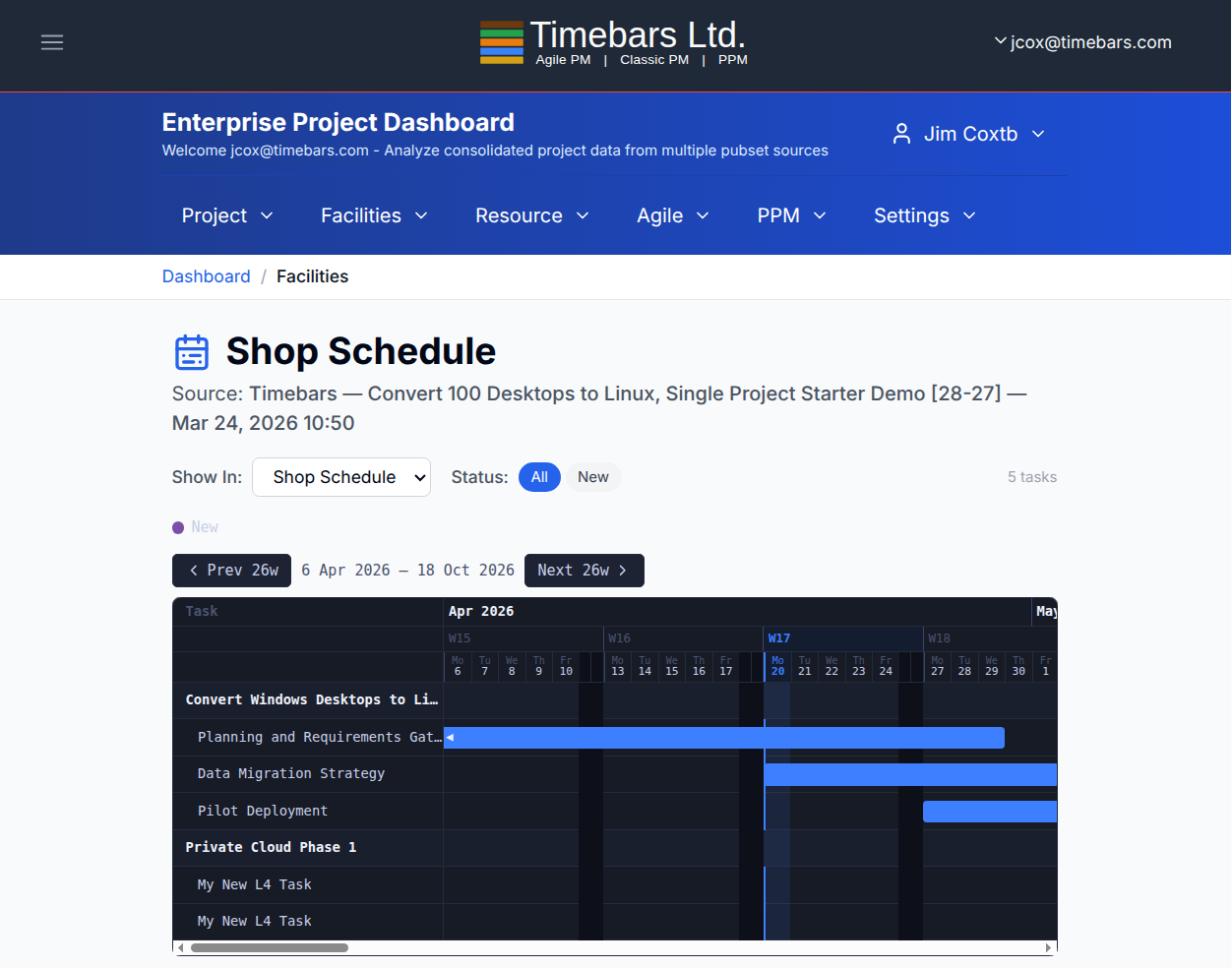
Show in Reports
Every task bar and milestone diamond carries a picklist that controls which reports that item appears in. Rather than including every scheduled item in every view, project managers can tag each bar precisely — selecting whether it surfaces in the local project reports, the Personal Dashboard, or the Enterprise Dashboard. This gives teams the ability to curate what stakeholders and individuals see in their reports without altering the underlying project structure, keeping dashboards focused and relevant rather than cluttered with every task in the portfolio.
The Facilities report demonstrates the power of this approach. Bars tagged for Facilities are pulled from across multiple projects and rendered together on a single Gantt chart, giving a consolidated visual of every facility booking regardless of which project raised it. A training room, a test environment, a piece of specialist equipment — any resource that is shared across project boundaries can be tracked this way, with clashes and availability visible at a glance. The report framework is extensible, so organisations can define additional report categories that match their own operational needs beyond the built-in defaults.
Tag once. Appear in exactly the right reports.
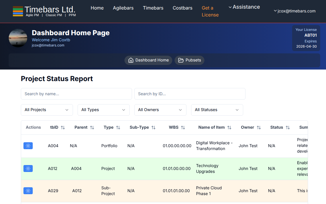
Enterprise Dashboard
The Enterprise Dashboard consolidates data from multiple pubset sources into a single analytical environment, giving senior managers and portfolio leads a unified view across the entire organisation. Rather than reviewing projects one at a time, the dashboard aggregates published data and presents it across dedicated analytical lenses: Project status and progress, Facilities and physical resource utilisation, Resource capacity and demand, Agile sprint performance, and Portfolio & Programme Management metrics. Each view draws from the same underlying pubset data, so figures are consistent regardless of which lens you are looking through.
Access is personalised — the dashboard recognises the signed-in user and surfaces the consolidated data relevant to their portfolio scope. The Settings menu allows administrators to configure data sources, adjust display preferences, and control which pubsets feed each view. For executives and programme directors who need to answer questions about the state of the portfolio without drilling into individual project plans, the Enterprise Dashboard is where that conversation starts — reliable, consolidated, and always reflecting the latest published data.
Every project. Every resource. One dashboard.
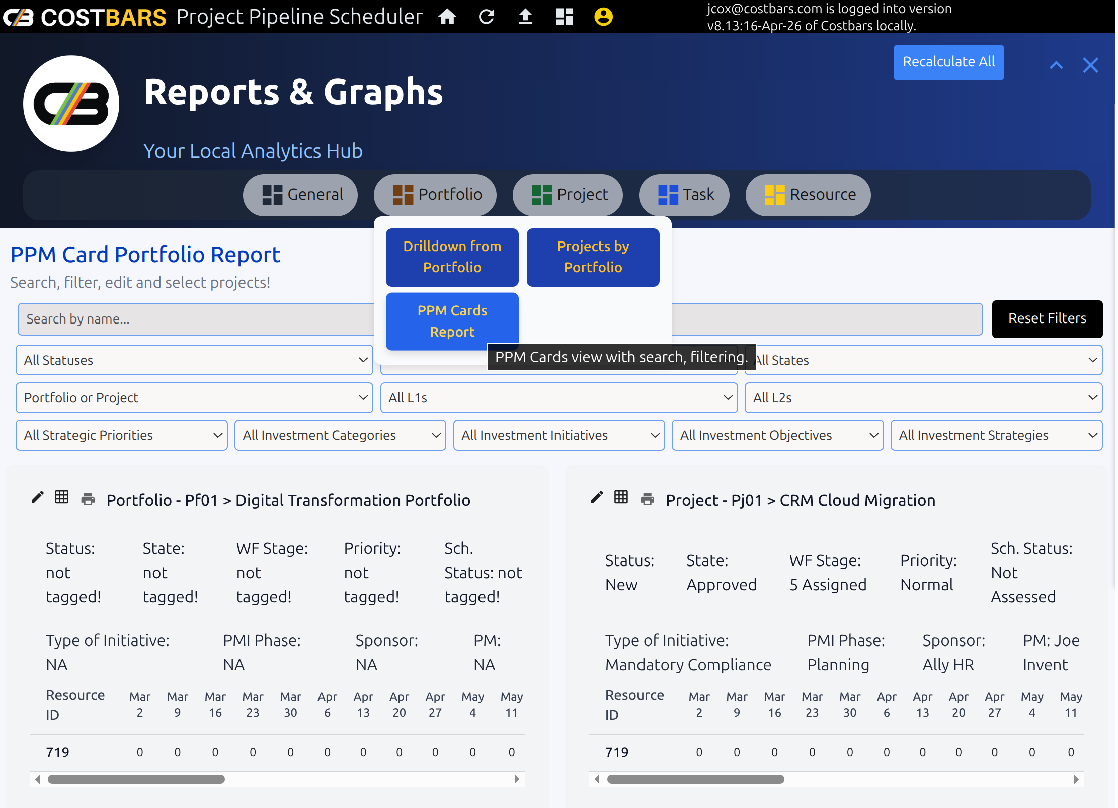
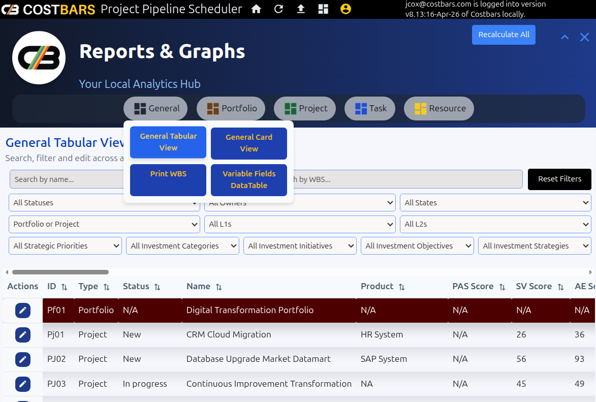
Report Menu
The Report Menu is your local analytics hub, bringing together every report and graph available within the application into a single organised navigation panel. Five report categories cover the full breadth of project data: General overviews for high-level summaries, Portfolio views for cross-project analysis, Project-level reports for schedule and cost detail, Task reports for granular progress tracking, and Resource reports for capacity and utilisation analysis. Each category surfaces the metrics most relevant to that level of the hierarchy, so whether you are presenting to a steering committee or drilling into an individual work package, the right view is one click away.
All reports are generated from the project data on your local canvas — no data leaves the application and no connection to an external reporting service is required. Charts and graphs update to reflect the current state of your projects, giving you analytics that are always in step with the plan rather than dependent on a scheduled export or a manual refresh. For project managers who need to communicate status quickly, the Report Menu turns the data already in the tool into presentation-ready outputs without additional effort.
Every chart, every metric, every level — one menu.
Personal Dashboard (Cloud)
The Personal Dashboard gives every user a single screen that cuts straight to what matters to them. At a glance you can see every task you own across all active projects, their current status, progress percentages, and upcoming deadlines — without having to open individual project plans or ask a project manager for an update. Your work is presented cleanly, ranked by priority and due date, so you start each day knowing exactly where to focus.
Unlike portfolio views designed for managers, this screen belongs to the individual. Overdue items surface automatically at the top, colour-coded so critical slippage is impossible to miss. As you complete work and update progress, the dashboard reflects the change immediately — giving you a real-time record of your own contribution across the organisation's entire project portfolio. No separate task list, no email chains, no status meetings needed just to know where you stand.
Your workload, your deadlines, your status — one screen.
Browser-Based, No Installation Required
All three applications run entirely in the browser — accessed from a URL like any web page, with nothing to install, configure, or maintain on the user's machine. There is no client software to deploy, no IT ticket to raise, and no version to keep up to date. Open the link, sign in, and your full project environment is available immediately on any modern browser, on any device, without touching the operating system beneath it.
Project data is stored directly in the browser's built-in IndexedDB — a structured local database that holds your schedules, resources, and metadata entirely on the machine in front of you. Nothing is written to a shared cloud server. That means your data stays within your own environment: behind your firewall, on your hardware, under your control. For organisations with strict data governance requirements or sensitive project information, this is the architecture that makes adoption straightforward where cloud-hosted tools cannot go.
Your data stays on your machine. Always.
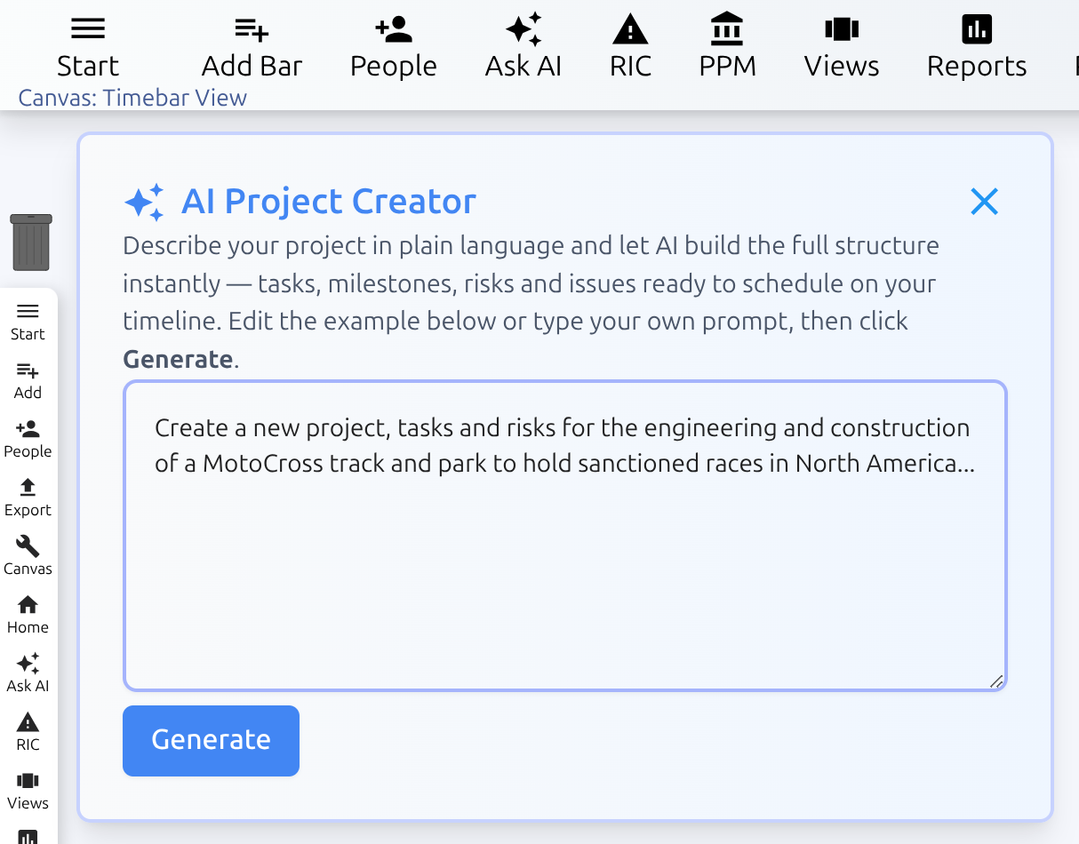
AI Project Creator
Describe your project in plain language and the AI builds a complete, ready-to-schedule structure in seconds. Type a brief outline — the objective, the key deliverables, any known constraints — and the generator produces a full hierarchy of tasks, milestones, risks, and issues, populated with realistic durations and logical sequencing. The result lands directly on your timeline, already structured and ready for resource assignment, with no blank-canvas starting point and no manual data entry to wade through.
The generated plan is a starting point, not a final answer. Every task, date, and dependency it creates is fully editable — drag bars, adjust durations, promote or demote items in the hierarchy exactly as you would with any manually built project. For project managers scoping a new engagement, the AI creator compresses hours of initial setup into a conversation. For teams running repeatable project types, it produces a consistent first-draft structure that can be refined rather than rebuilt from scratch each time.
From a sentence to a scheduled project plan in seconds.
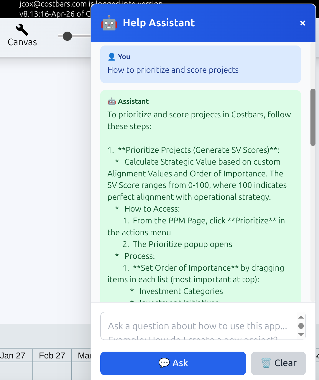
AI Help Assistant
The built-in Help Assistant puts the entire application knowledge base at your fingertips, powered by Google Gemini. Every help article, feature guide, and workflow explanation has been integrated directly into the AI model, so when you ask a question you get an answer that is specific to this application — not a generic response drawn from the open web. Ask how to set a baseline, how to configure a custom field, or how dependencies behave when a constraint is applied, and the assistant responds with accurate, contextual guidance drawn from the same documentation the support team uses.
The assistant is available without leaving your current view, so you never lose your place in a planning session to go searching through help pages. Type a question in plain language — as you would ask a colleague — and get a direct, actionable answer in seconds. For new users getting up to speed, it replaces the need to read documentation cover to cover. For experienced users hitting an unfamiliar corner of the application, it is faster than any search index. The more specific your question, the more precise the answer.
Ask anything. Get answers from someone who knows the app.
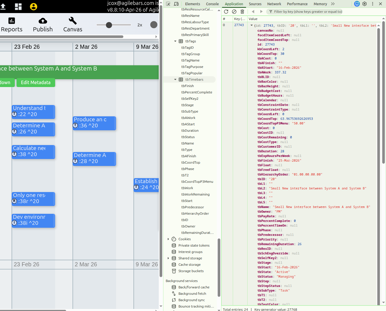
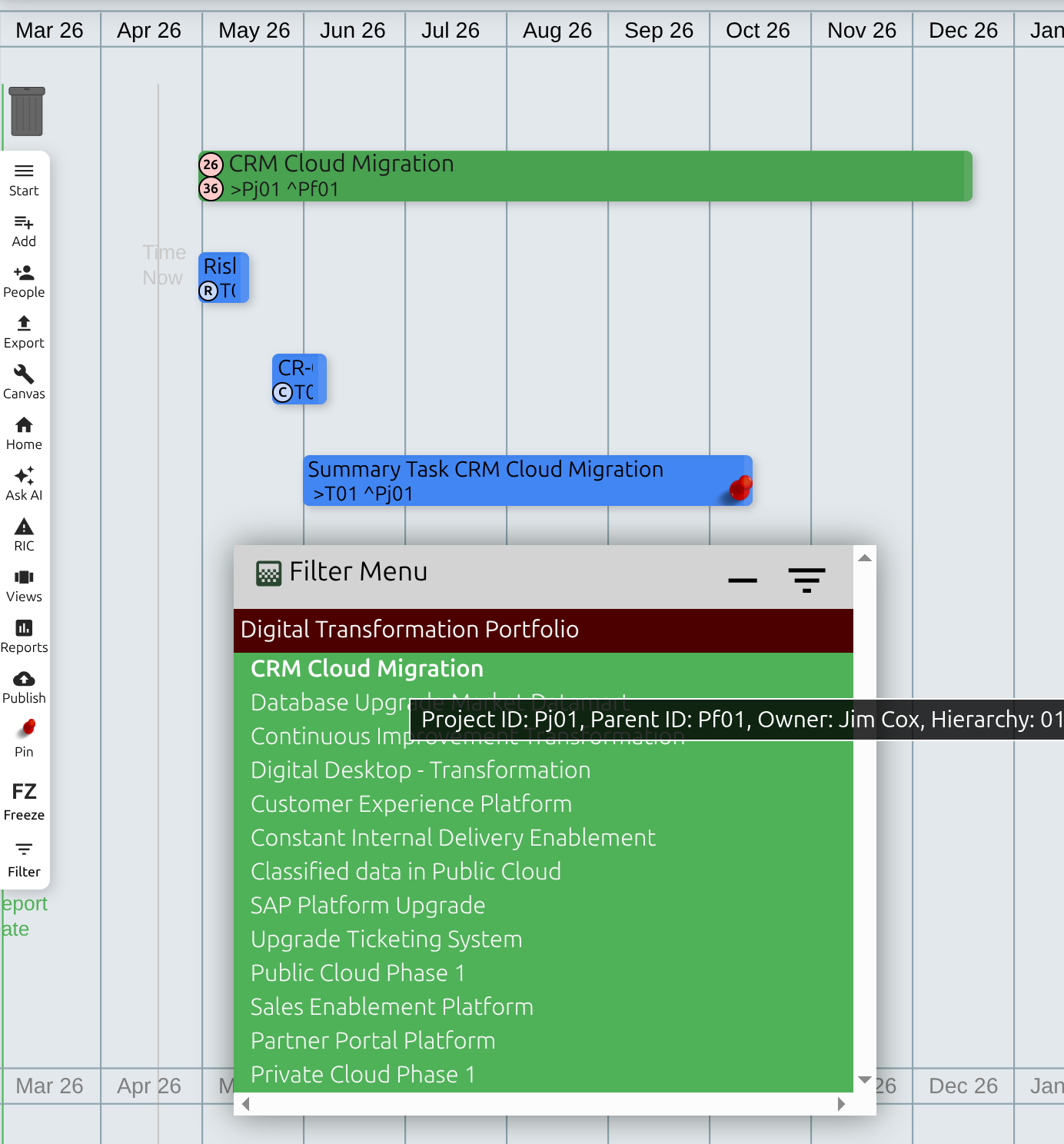
Filter Menu
The Filter Menu gives you precise control over what is visible on the canvas at any moment. Accessed via the pink FM tab on the left-hand edge of the timeline, it renders your project hierarchy as a set of clickable hyperlinks — L1 portfolio groupings in brown, L2 projects in green, and L3 work packages in orange. Click any level to apply a filter instantly, stripping away everything above and below it so the canvas shows only the bars you need to work with. When the full portfolio view becomes too dense to navigate, the Filter Menu is how you cut through the noise.
Filters are persistent. The application remembers the last level you selected, so when you return to the canvas it opens exactly where you left off — filtered view intact, no need to re-navigate to your working project each session. Collapse the menu with the FM tab to reclaim canvas space when you no longer need it, and bring it back in one click when you do. For Agilebars users the menu operates at the single project level, giving sprint teams the same focused view within their own simplified two-tier hierarchy.
Cut the canvas down to exactly what you need to see.
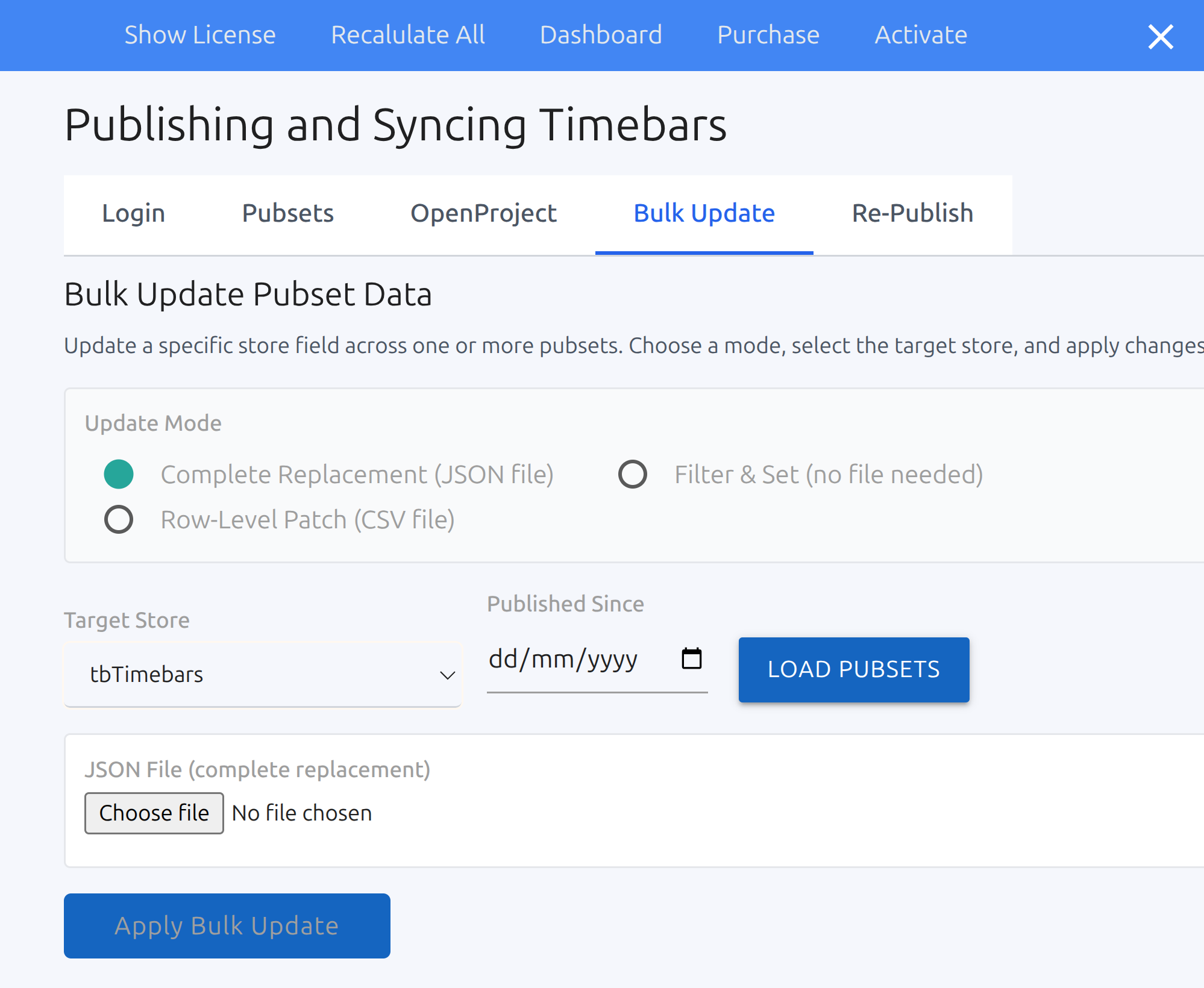
Bulk Update Form
The Bulk Update Form is available on the Publishing page and lets you apply a field change across multiple pubsets in a single operation. Choose the update mode, select the target store, define the value to apply, and confirm — the change propagates across every selected pubset immediately, without opening each one individually. Whether you are correcting a status field that was set incorrectly across a programme of projects, updating an owner after a team change, or resetting a metadata value at the end of a reporting period, bulk update turns a repetitive manual task into a single form submission.
The form is deliberately focused: one field, one value, one operation at a time. That constraint is what makes it safe to use across large numbers of pubsets without risk of unintended side effects. Select your target store carefully, preview what will be affected, and apply with confidence. For administrators managing a large project portfolio, this is the tool that keeps data consistent across the estate without requiring individual project managers to make the same change in each of their own plans.
One change. Every pubset. Done.
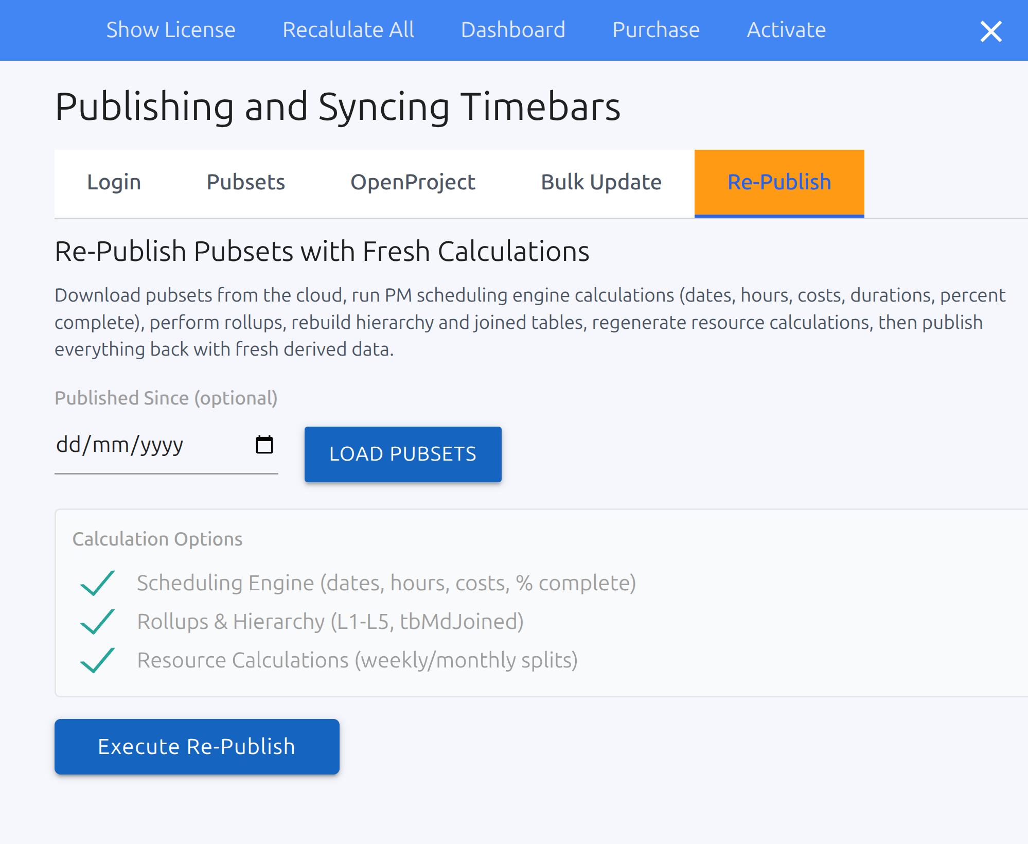
Re-Publish with Fresh Calculations
The Re-Publish form triggers a full recalculation cycle across your selected pubsets and pushes the results back to the cloud in one operation. Every derived value is recomputed from source: the scheduling engine recalculates dates, hours, costs, and durations; rollups are rebuilt from task level through to portfolio; the hierarchy and joined tables are reconstructed; and resource calculations are regenerated from current allocation data. The published dataset that emerges reflects the true current state of the portfolio — not a snapshot from the last time someone manually saved a project.
This is the tool to reach for when source metadata changes in a way that affects calculated values across multiple projects simultaneously. A rate change to a resource pool, a revision to working calendars, or an update to a custom field that feeds downstream calculations — rather than opening and republishing each affected project individually, a single Re-Publish run processes the entire selection and restores consistency across the estate. The operation is repeatable and auditable, giving administrators confidence that the data visible to stakeholders and dashboards is always derived from the same calculation rules.
Stale derived data, corrected across every project at once.
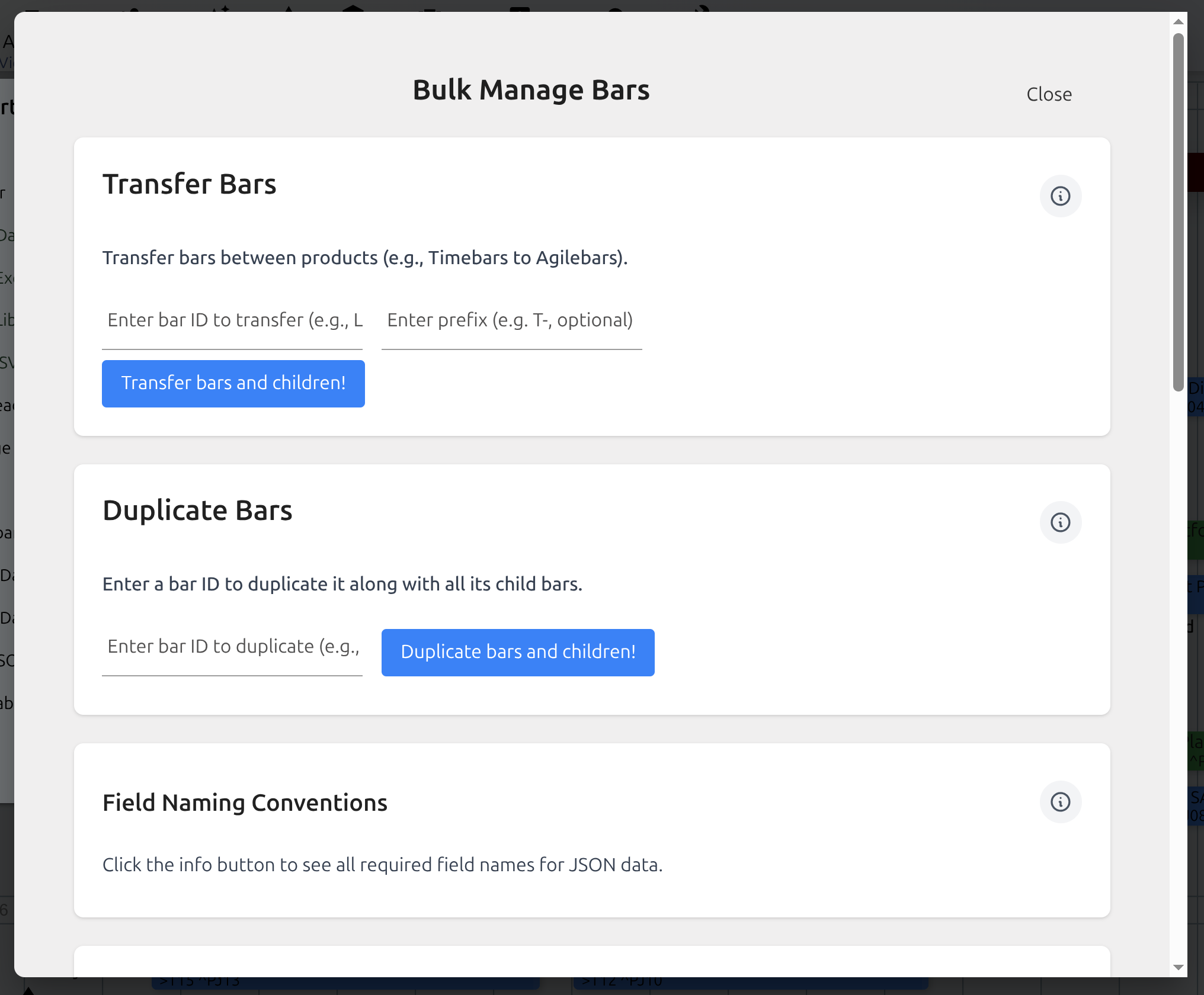
Bulk Manage Bars
The Bulk Manage Bars form gives administrators and project managers the ability to manipulate project structures at scale without touching the canvas directly. Transfer bars between projects to restructure a portfolio after a reorganisation, duplicate entire work packages to use a proven task structure as the foundation for a new project, or create bars in bulk by importing structured data from JSON or CSV. Operations that would take considerable time bar-by-bar on the canvas are resolved in a single form submission.
The import path from JSON and CSV is particularly useful for organisations that generate project structures from external systems — contract management tools, bid management software, or planning templates maintained outside the application. Rather than manually recreating that structure on the canvas, feed the data directly into the form and the bars are created with hierarchy, metadata, and sequencing intact. Combined with the duplicate and transfer functions, the Bulk Manage form gives you the full toolkit for keeping a large, evolving project portfolio organised without disruptive manual rework.
Restructure, duplicate, and build at scale — not one bar at a time.
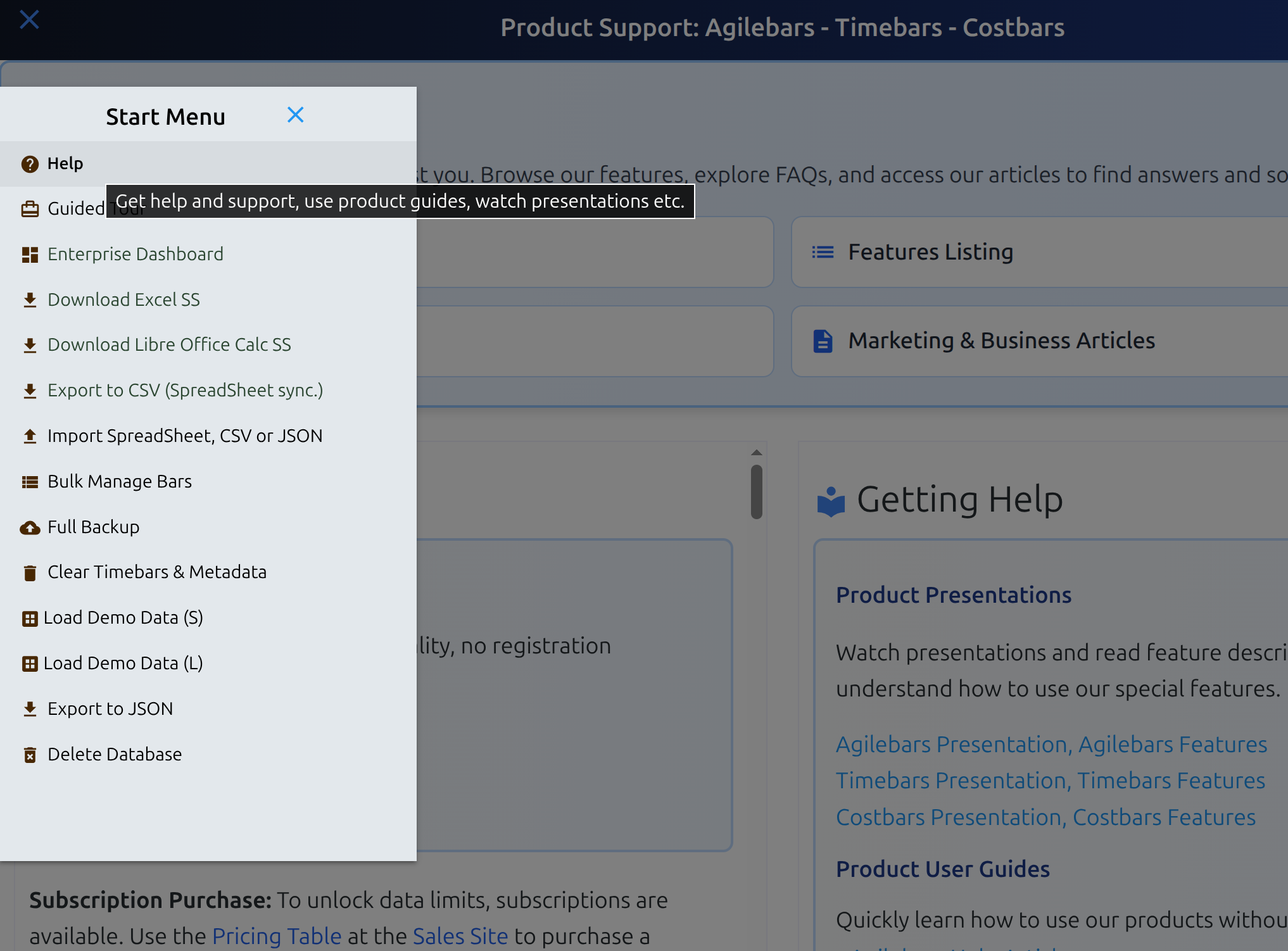
Help & Support Resources
Every application links directly to a full suite of support resources, accessible whenever you need them without leaving your workflow. The Help section brings together feature documentation, frequently asked questions, and a library of articles covering everything from first-time setup through to advanced configuration. Whether you are a new user building familiarity with the interface or an experienced manager tracking down the specifics of a particular behaviour, the answers are organised and searchable without needing to raise a support ticket.
The resources are maintained alongside the application itself, so documentation reflects the current version of the product rather than lagging behind it. Feature guides walk through each area of the application with practical context, FAQ entries address the questions the support team hears most often, and articles cover common workflows, best practices, and integration scenarios in depth. For teams rolling out the application across an organisation, the Help section is the first place to direct new users — reducing onboarding time and keeping the support burden manageable as adoption grows.
Answers at hand, whenever the question arises.
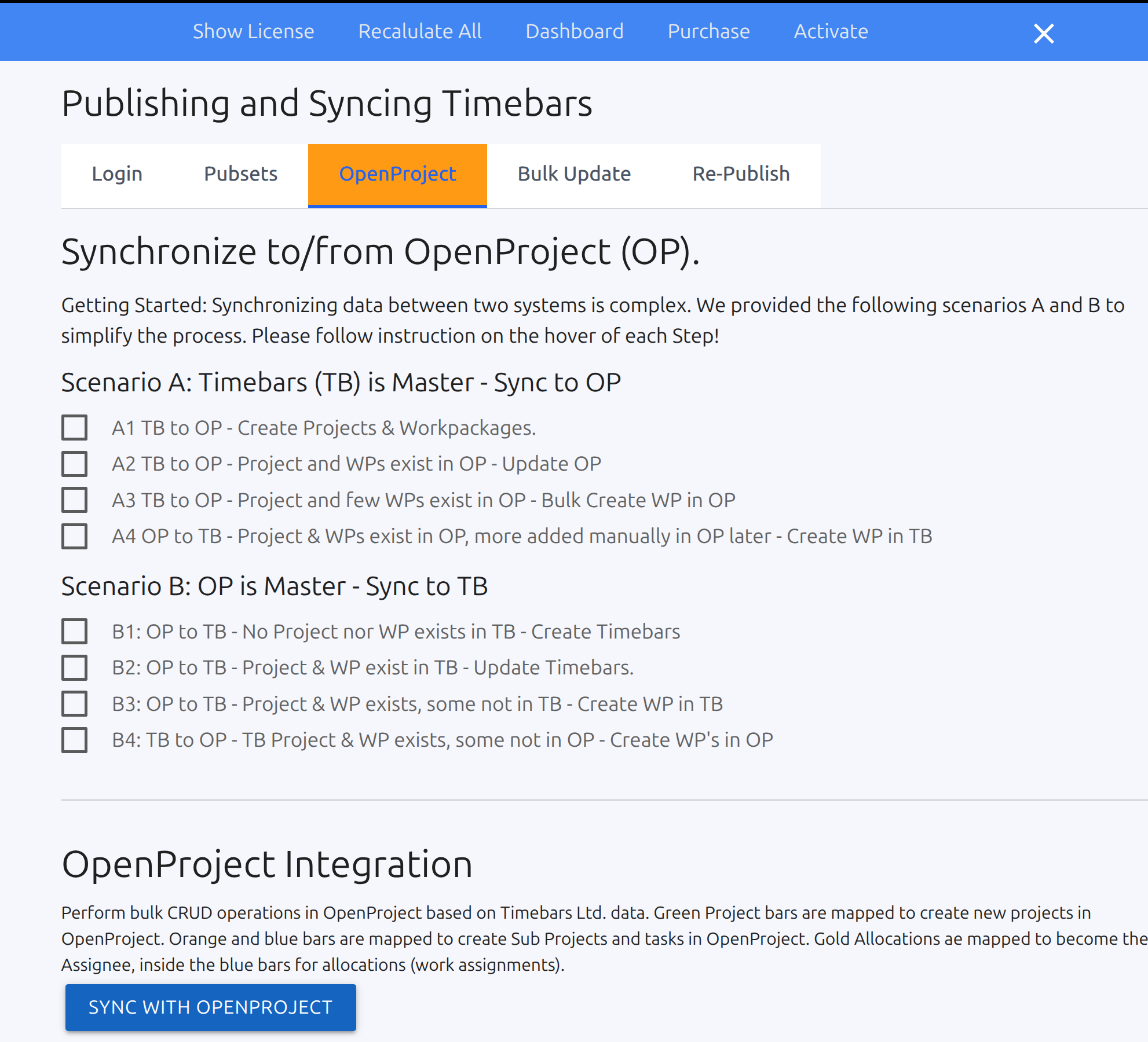
OpenProject Integration
The OpenProject integration creates a live synchronisation bridge between the application and your OpenProject instance, allowing data to flow in both directions without manual export and re-import cycles. Project structures, tasks, assignments, and progress updates maintained in either system can be kept in alignment, so teams working in OpenProject and portfolio managers working in the scheduling canvas are always looking at the same underlying data. The integration is designed for organisations that run OpenProject for team-level execution while using Timebars, Agilebars, or Costbars for portfolio-level planning and reporting.
Because synchronising two live systems carries complexity, the integration is structured around two guided scenarios — Scenario A and Scenario B — that cover the most common setup patterns. Each scenario walks through the required steps in sequence, with hover instructions on every step explaining exactly what to do and why. Follow the scenario that matches your setup, work through the steps in order, and the synchronisation is configured correctly without needing to understand the underlying API mechanics. For administrators setting this up for the first time, the scenario framework removes the guesswork and gets both systems talking reliably.
Two systems, one source of truth.
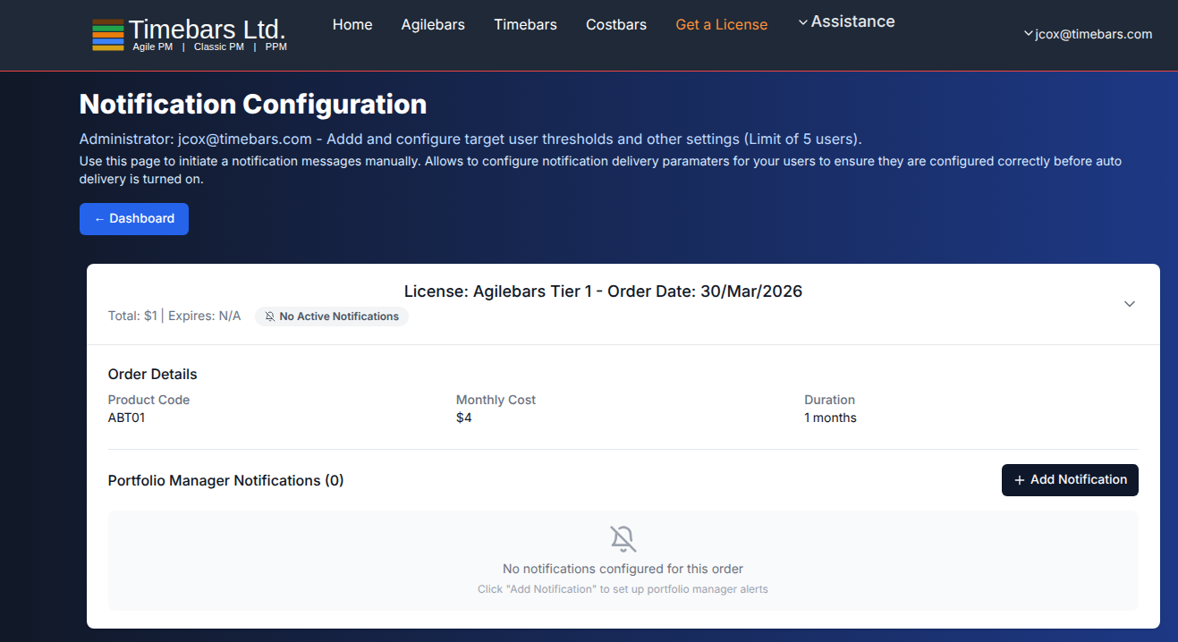
Text Notifications
The Notifications system allows administrators to configure automated text message delivery to up to five target users, with thresholds and delivery parameters set individually for each recipient. Each user's notification profile defines what triggers a message, at what threshold values, and through which delivery channel — giving precise control over who gets alerted, when, and under what project conditions. Configuration is handled centrally by the administrator, so notification behaviour is consistent and governed rather than left to individual users to set up themselves.
Before enabling automatic delivery, the manual send function lets administrators initiate a test notification to verify that delivery parameters are configured correctly for each user. Send a message, confirm receipt, adjust the settings if needed, and only then turn on automated delivery — eliminating the risk of silent failures or misconfigured alerts reaching users at the wrong time. For organisations where timely escalation of project thresholds is business-critical, this is the tool that ensures the right people are informed the moment a trigger condition is met.
The right alert, to the right person, at the right threshold.
Included in every product
A Shared Platform Across the Entire Suite
Whether you run Agilebars, Timebars, or Costbars, the following management capabilities and supporting systems come built in — no extras to bolt on, no separate modules to purchase.
Additional Management Features
Risks, Issues & Change Requests
Track risks, issues, and formal change requests directly on the project canvas. Each type carries its own colour-coded indicator and severity level, with a dedicated form for owner, mitigation, status, and resolution notes. Critical items surface immediately — no separate register required.
Supply & Demand Grids
See resource supply against project demand in a time-phased grid. Each column shows exactly how much capacity is consumed per period, making it straightforward to spot shortfalls, overallocation, and idle capacity before they affect delivery.
Local Reports & Graphs
Generate charts and reports directly within the application — no export to a separate BI tool. Schedule variance, cost performance, resource utilisation, and progress summaries are all available from the built-in reporting engine, ready to print or share.
Enterprise Dashboard
Publish project data to a secure cloud dashboard accessible to anyone in your organisation with the right role. Executives and governance boards can view live charts, progress summaries, and risk indicators from any browser without needing access to the tool itself.
Personal Dashboard
Each team member gets a personal view filtered to their own assignments, deadlines, and resource commitments. The personal dashboard cuts through portfolio noise so individuals can focus on what they are responsible for without losing sight of the bigger picture.
Strategic Texting (Phone)
Receive SMS alerts on your mobile when projects cross critical thresholds — schedule slippage, budget overrun, or risk escalation. Stay informed without being chained to a desktop or logged into the application.
Supporting Systems
Custom Fields, Picklists & Tagging
Define your own metadata fields, picklist values, and tags through the spreadsheet Tags Table. These flow through every form, filter, and report in the application, ensuring your data matches your organisation's terminology rather than forcing you into a pre-set schema.
Spreadsheet Sync
Import and export all project data using Excel, LibreOffice Calc, or OpenOffice Calc templates. Drag the spreadsheet onto the canvas to import; pull data back out at any time for offline use, sharing, or custom analysis. The round-trip is lossless.
Cloud Publishing & Role-Based Access
Control exactly who sees which project data by publishing with role-based permissions. Publish summary data for executives, detailed task data for project teams, and risk registers for governance — each audience sees what they need and nothing more.
Ask AI for Help
An AI assistant is built directly into every product. Ask it to explain scheduling concepts, suggest risk mitigations, interpret charts, or walk you through any feature in plain language. No separate AI subscription required — it is part of the platform.
Ask AI to Create Projects & Business Cases
Describe a project in plain language and let the AI generate a structured plan — work packages, tasks, milestones, resource requirements, and a business case summary — ready to review and import onto the canvas. Dramatically reduces the time spent on initial project setup.
FOCD Forms
Formal Change Order and Decision forms capture approved scope changes, schedule adjustments, and key decisions in a structured, auditable record. Each form links directly to the affected items on the canvas, maintaining full traceability between decisions and the live plan.